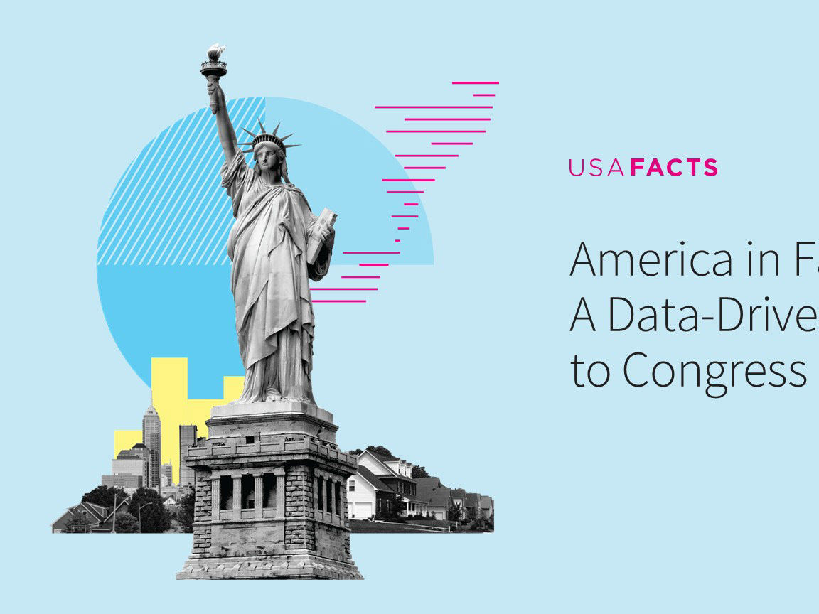
Our nation, in numbers:
Making government data more accessible and easy to understand
Making government data more accessible and easy to understand
When former Microsoft CEO Steve Ballmer retired from Microsoft to focus on philanthropy work, he was hunting for government data to understand how tax dollars were being spent and what the impacts of those investments were. Where does the money come from? How is the money spent? Where does it go? Realizing there was a huge gap, he assembled a small team of economists, writers, designers, and researchers to help build a repository of government data and determine how to organize and make sense of it.
I started consulting with USAFacts in 2016, just as the team was being formed. As with any small startup, every person on the team wore a lot of different hats. I helped with initial creative and brand strategy direction (in collaboration with USAFacts' agency of record Artefact Group), website design, presentation design, annual report design, social media visuals, infographics, email newsletter designs, and much more. Together we wrote the first annual report, 10-K document, and launched the v1 usafacts.org website in April 2017. Steve did a number of speeches on the spring 2017 press tour (NPR, NYT, The Verge, Geekwire, CNN, TedX Pennsylvania, Morning Joe)
I started consulting with USAFacts in 2016, just as the team was being formed. As with any small startup, every person on the team wore a lot of different hats. I helped with initial creative and brand strategy direction (in collaboration with USAFacts' agency of record Artefact Group), website design, presentation design, annual report design, social media visuals, infographics, email newsletter designs, and much more. Together we wrote the first annual report, 10-K document, and launched the v1 usafacts.org website in April 2017. Steve did a number of speeches on the spring 2017 press tour (NPR, NYT, The Verge, Geekwire, CNN, TedX Pennsylvania, Morning Joe)
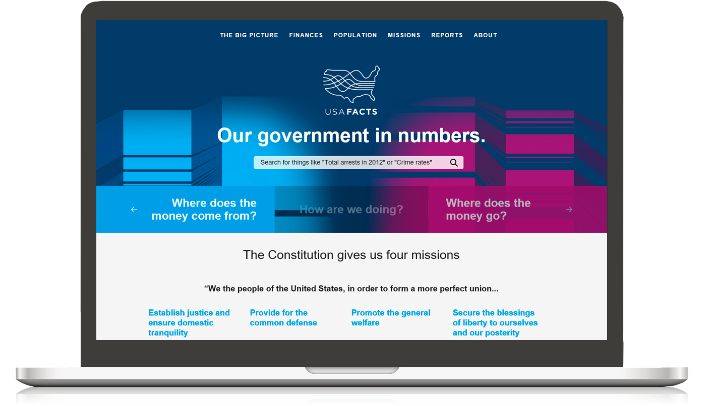

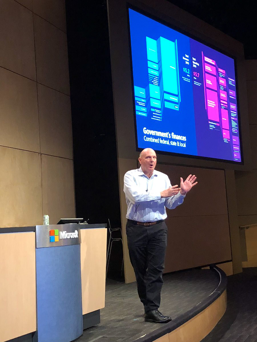

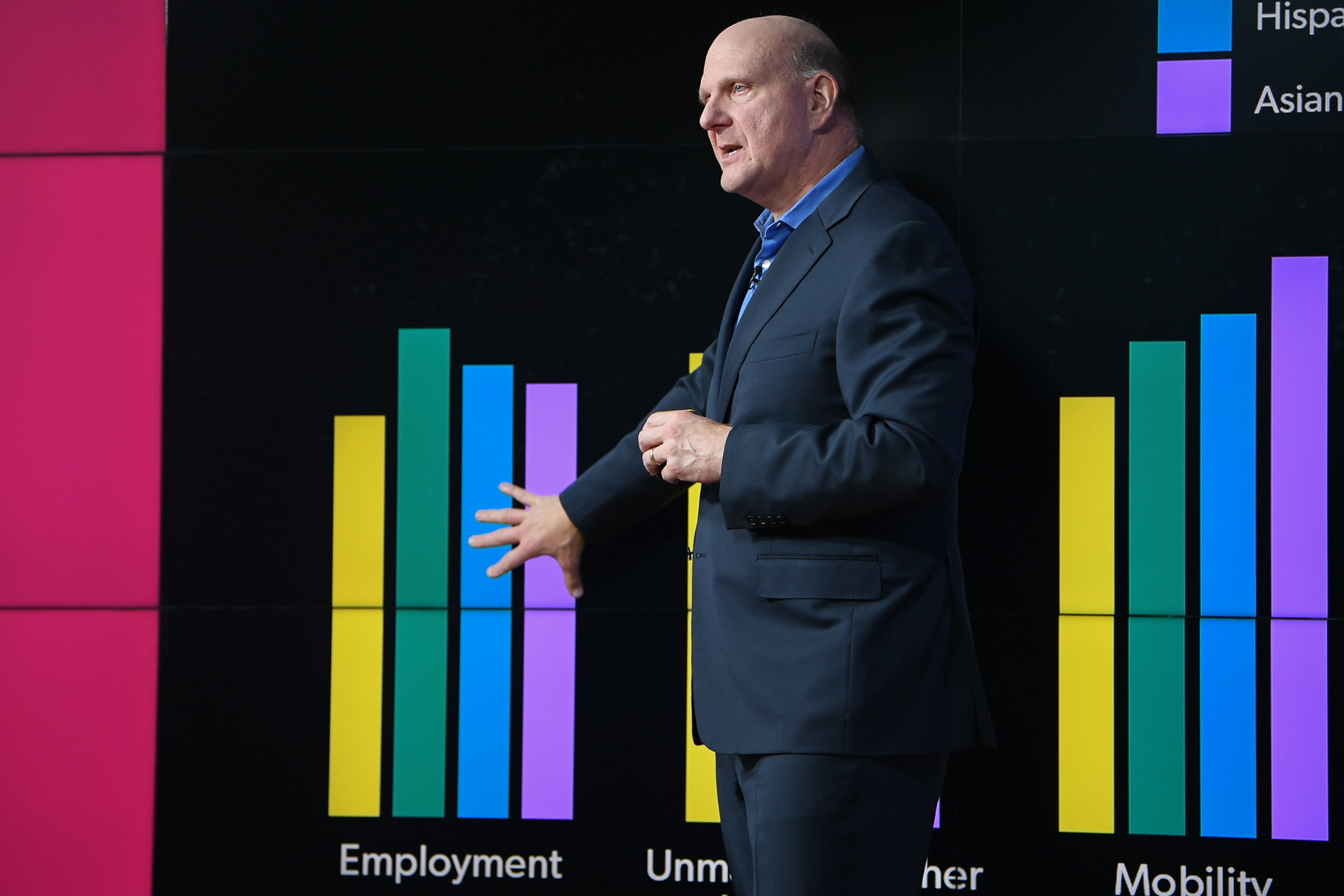
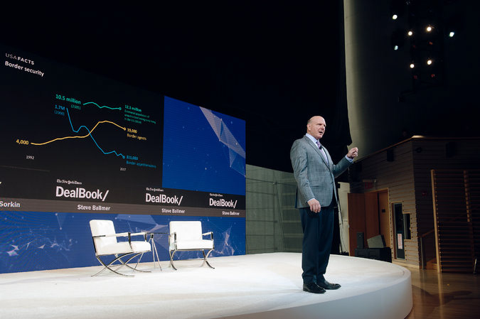

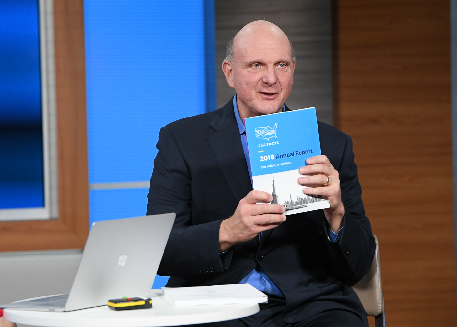

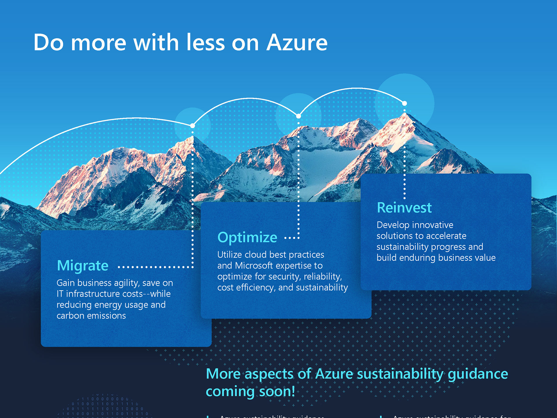
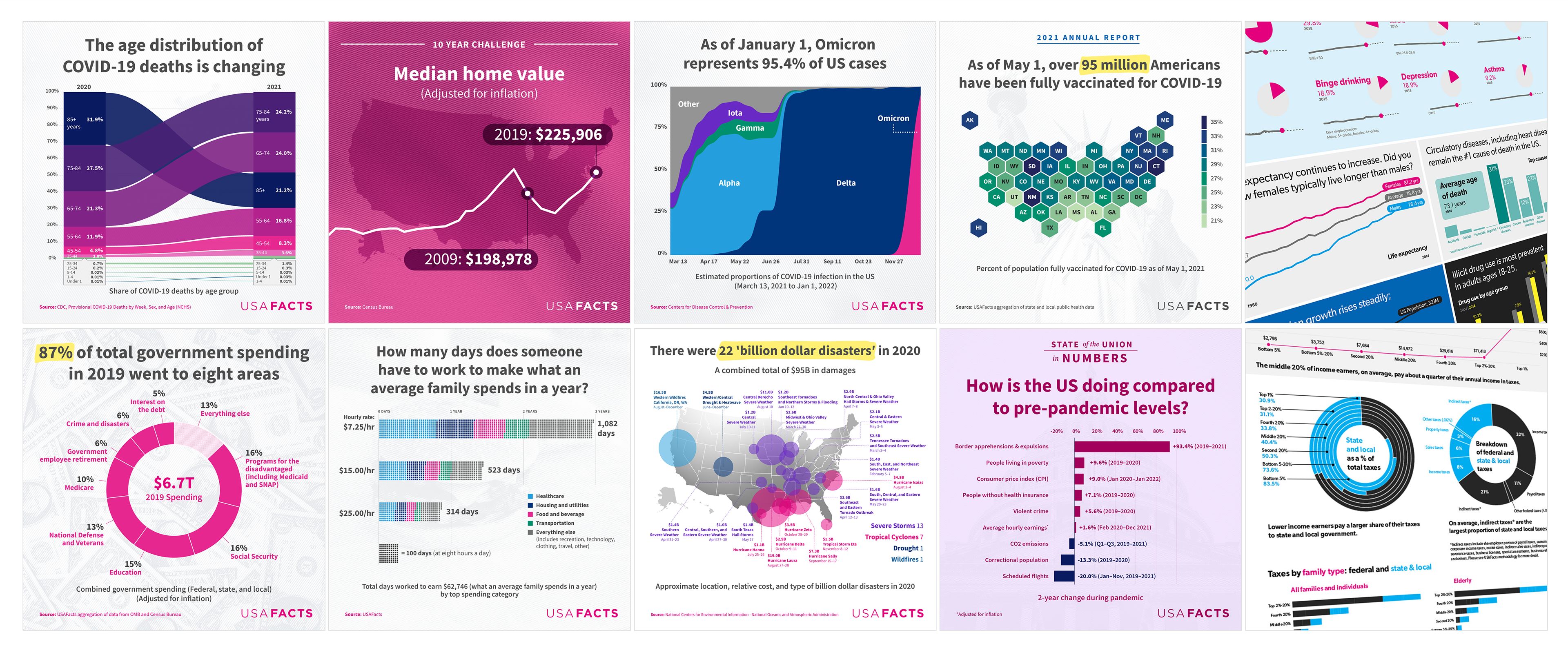
I worked with Steve to develop the content and visuals for his presentations, focusing on highlighting interesting pieces of the data and explaining the unique structure of the project based on the Preamble to the US Constitution. Along with slides and content, we were churning out a ton of charts and graphs for reports, website articles, social media, and presentations.
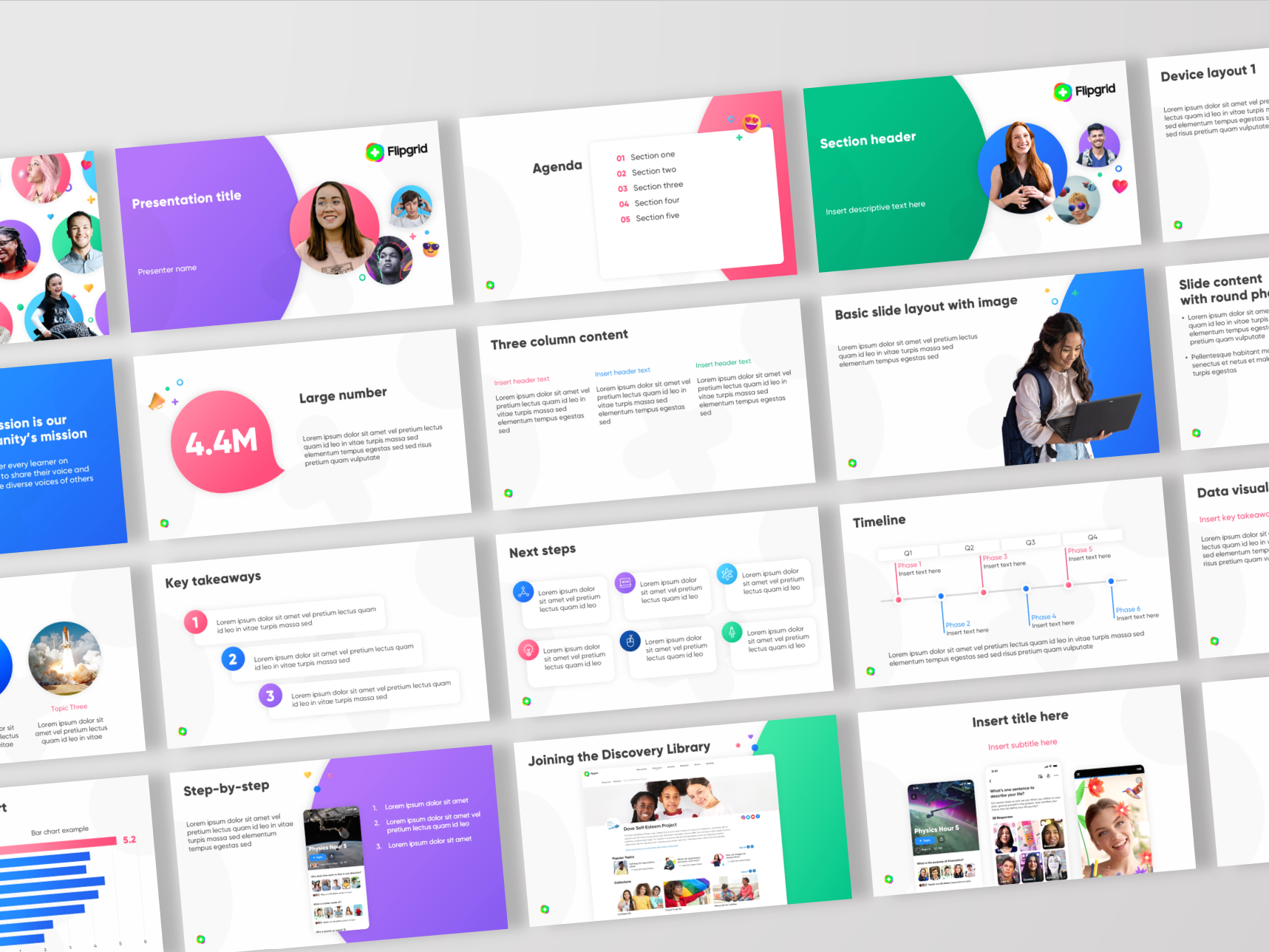
I developed custom PowerPoint templates and unique graphics. Hand-crafted data visualizations were created with Microsoft Excel and Adobe Illustrator. Research and data analysis was developed in partnership with internal team. I established visual guidelines for data visualizations and implemented across a variety of products from annual reports to social media graphics.
Building the USAFacts brand from the ground up
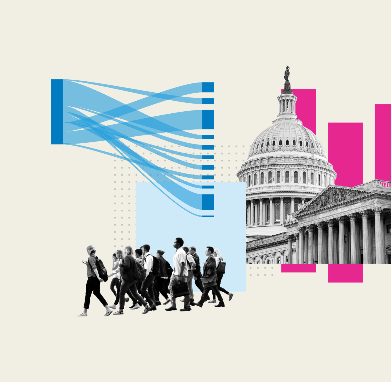
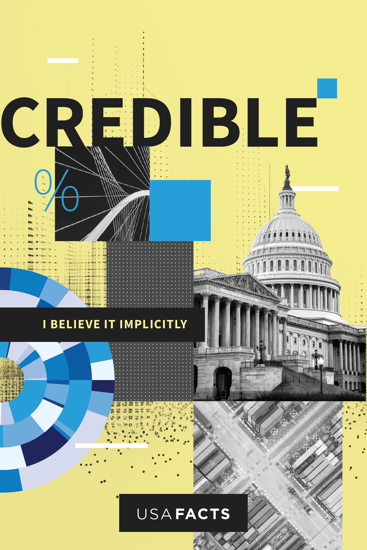
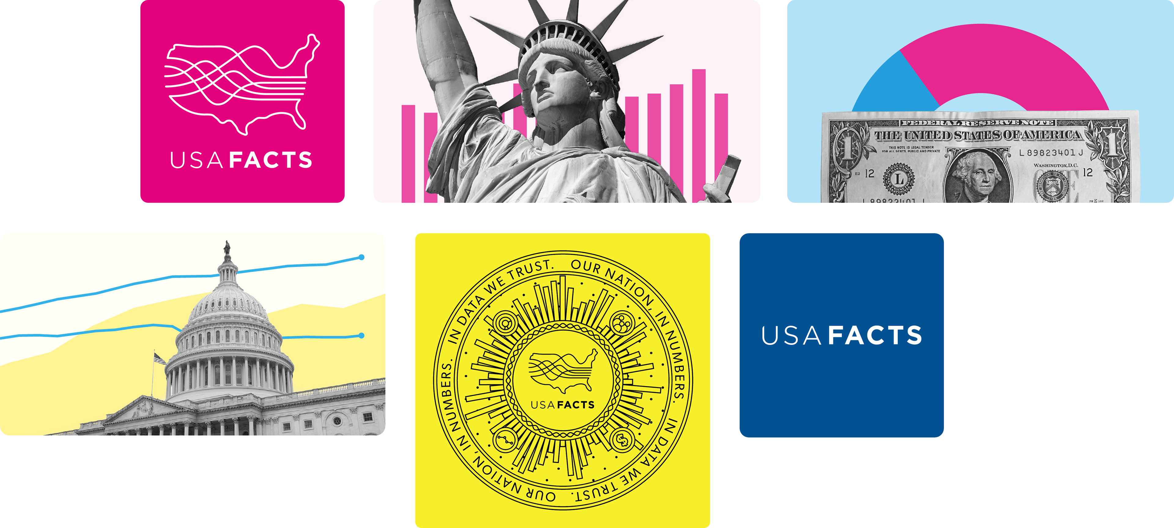
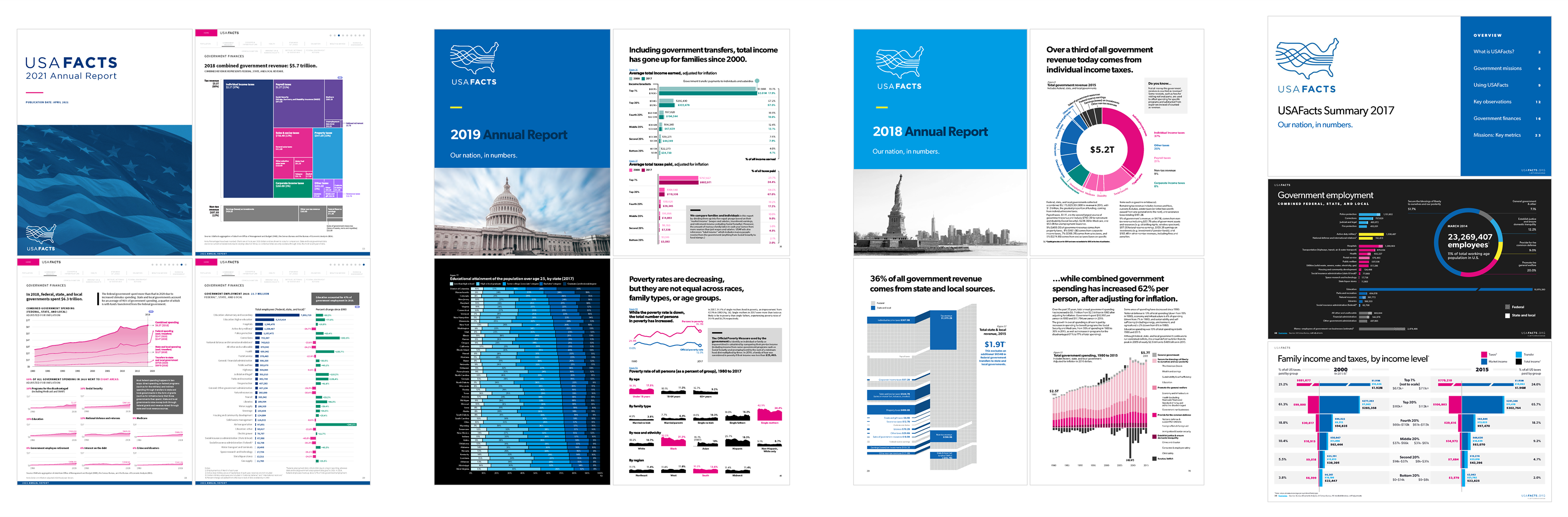
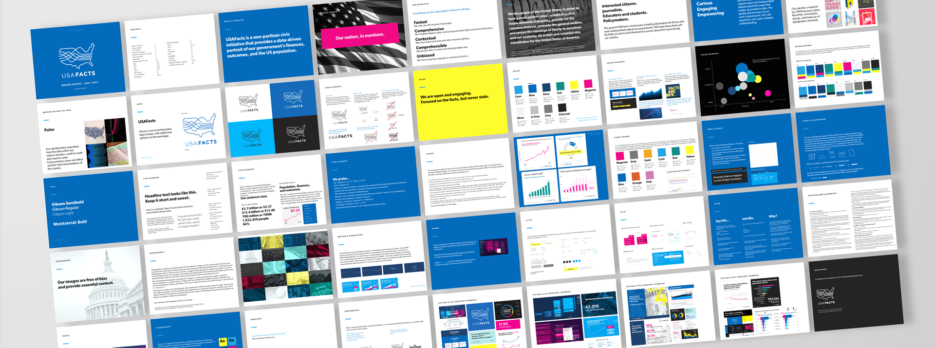
In preparation for USAFacts' public debut in 2017, we developed a set of initial brand assets (logo, color palette, mood boards, typography etc.) in collaboration with Artefact Group. We wanted to be distinct from government agency sites and dull PDFs, so we leveraged a bold color palette (cyan, magenta, and yellow) which we dubbed "Modern Pop." We chose a friendly sans-serif typeface (Gibson) to help the brand feel friendly and approachable. Artefact developed the final logo which illustrated the concept of America's coast-to-coast borders "from sea to shining sea" and also alluded to the flow of data and the concept of "cause and effect."
As we started to create more marketing materials and begin to work with more agencies and external teams it was clear that a more robust brand style guide was needed. In the summer of 2017, I drafted v1 of the first USAFacts brand style guide. This included a deeper dive into USAFacts' brand personality, the use of varying color palettes to create emotional connections for different audiences and purposes, guidance for charts and data visuals, photography treatments, and more.
"You have been hugely helpful on ensuring our visuals and design are consistent, compelling, and on brand."
Poppy MacDonald, President, USAFacts
Poppy MacDonald, President, USAFacts
Charting new territory for USAFacts' data visualizations
With the goal of improving the functionality and effectiveness of our data visualizations, I worked to revamp USAFacts' data visualization guidance, color palettes, and templates.
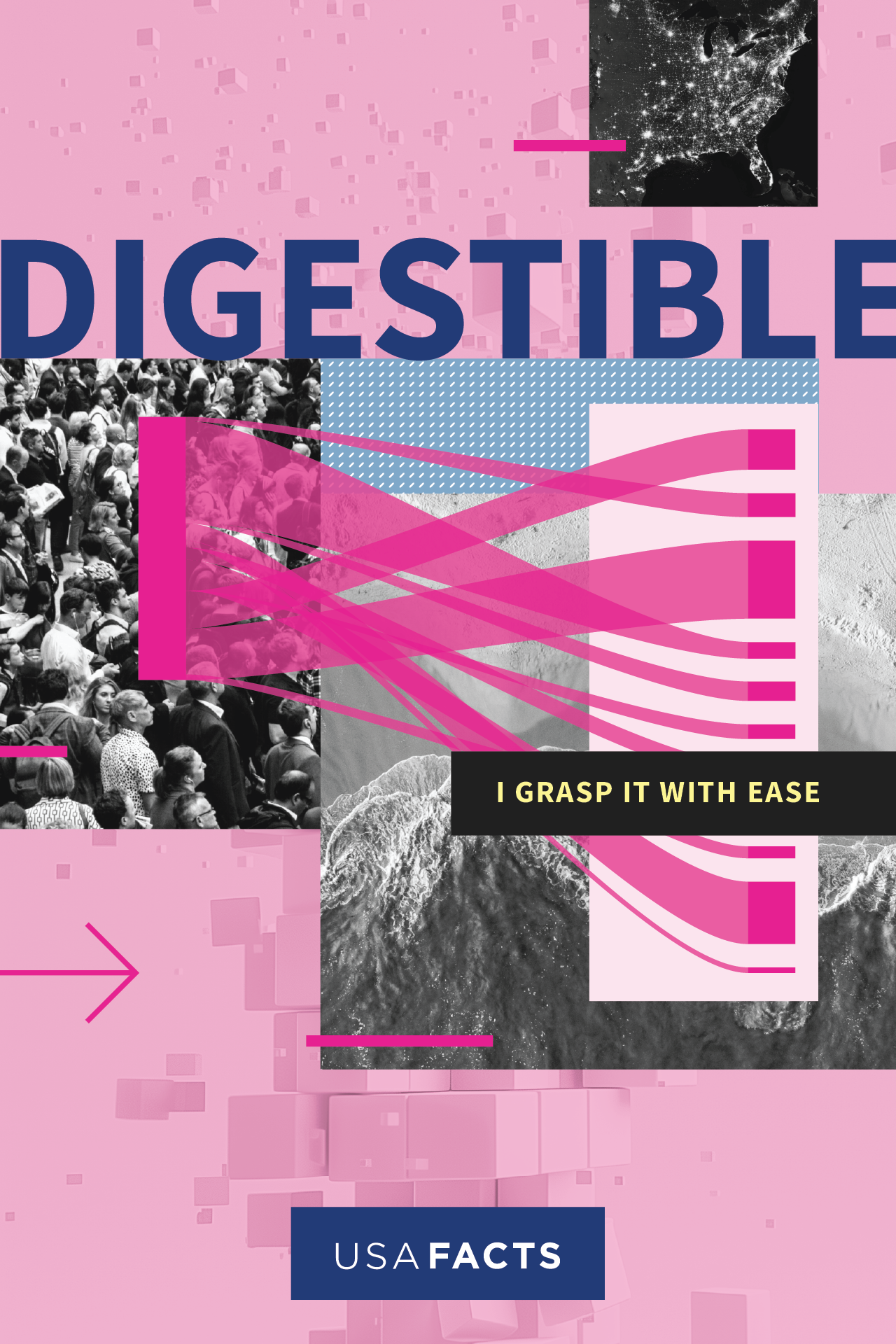
The primary guidance from the internal team was a desire to use fewer colors in our data viz palette as well as a preference to lean away from warmer hues like orange.
The primary guidance from the internal team was a desire to use fewer colors in our data viz palette as well as a preference to lean away from warmer hues like orange.
To solve this need, I created a cool-toned categorical palette using magenta, navy blue, cyan, teal green, and purple. These were aligned to the primary set of brand colors as closely as possible, while also making adjustments for accessibility and color blindness. Additionally, I created individual sequential and diverging color palettes for maps and chart visualizations.
I also led internal training in the spring of 2021 to roll out the updated guidance and provide best practices for implementation with visual examples, data visualization principles, and checklists.
"We were seeing our current brand color palette was too limiting for robust data visualizations while also not providing enough guardrails. Bottom line, the palette wasn’t working for content creators, and the palette wasn't working for brand police. I cannot stress enough how much research, re-evaluation, and thoughtfulness went into this updated palette. Alicia had to find a balance of keeping tight to our brand while also allowing for breadth to support various visualization needs."
Lisa Conquergood, Chief Marketing Officer, USAFacts (2021)
Lisa Conquergood, Chief Marketing Officer, USAFacts (2021)


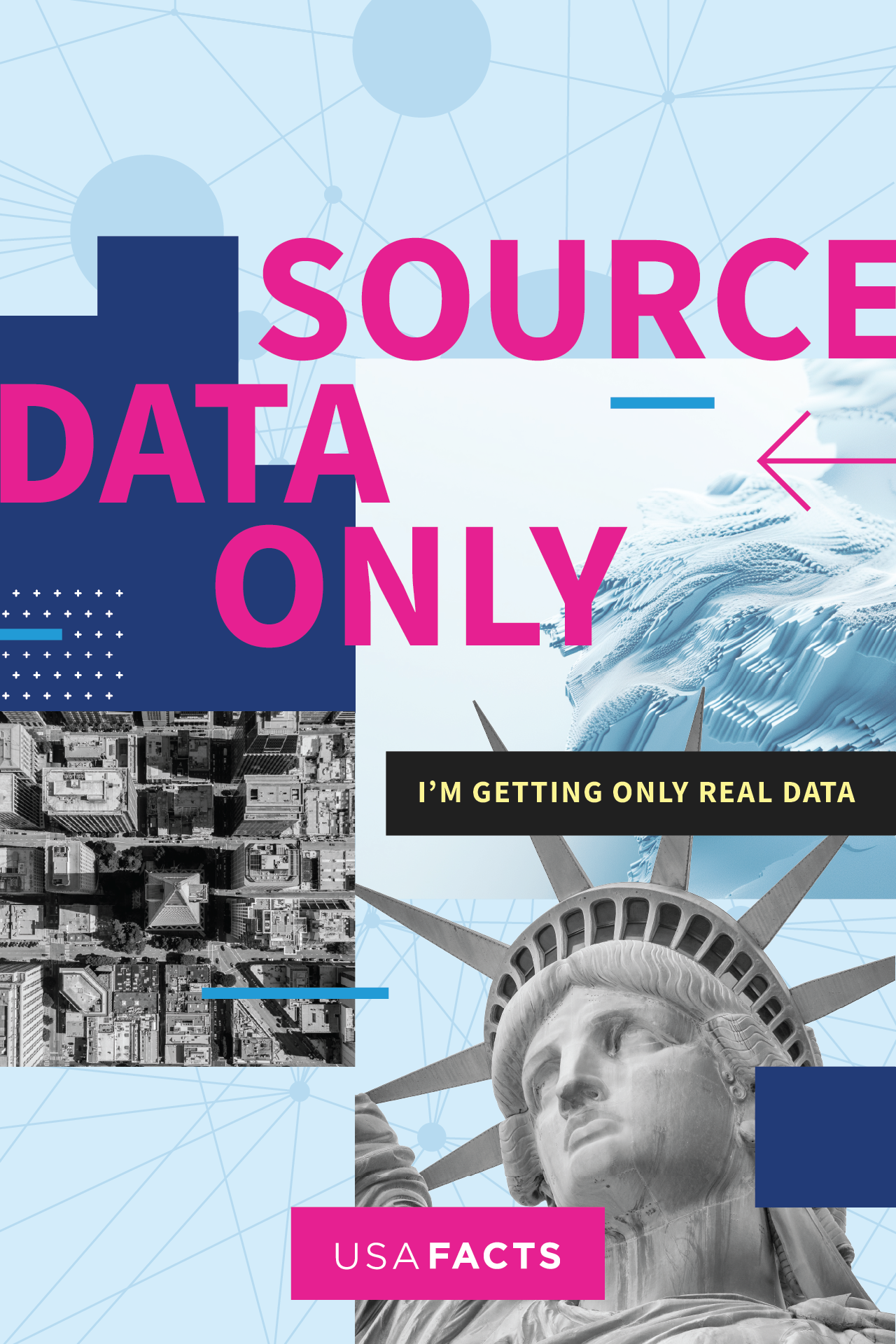
Refreshing USAFacts' brand in 2024
We wanted to bring the visual concept of data visualization front and center. USAFacts is less about shouting "America!" from the rooftops and more about how USAFacts helps make it easier for people to get unbiased insights on government data.
Our visuals had been showing up on social as a constant stream of pink and blue. We felt it was important to return to our roots with more pops of color like yellow to provide balance and visual excitement. This visual approach helped set USAFacts' apart from others: government sites, other foundations and organizations, corporations etc.
Finally, as a good steward for accessibility, we committed to use of colorblind-safe palettes, meeting minimum color contrast ratios, increasing legibility, and going the extra mile to make our visuals crisp, clear, and understandable at-a-glance.
Finally, as a good steward for accessibility, we committed to use of colorblind-safe palettes, meeting minimum color contrast ratios, increasing legibility, and going the extra mile to make our visuals crisp, clear, and understandable at-a-glance.
We launched an updated brand style guide in 2024 along with new typography recommendations, updated data visualization color palettes, and a wide breadth of assets for digital marketing like social share images, templates, and photography.