Experimental brand refresh to help attract a younger demographic
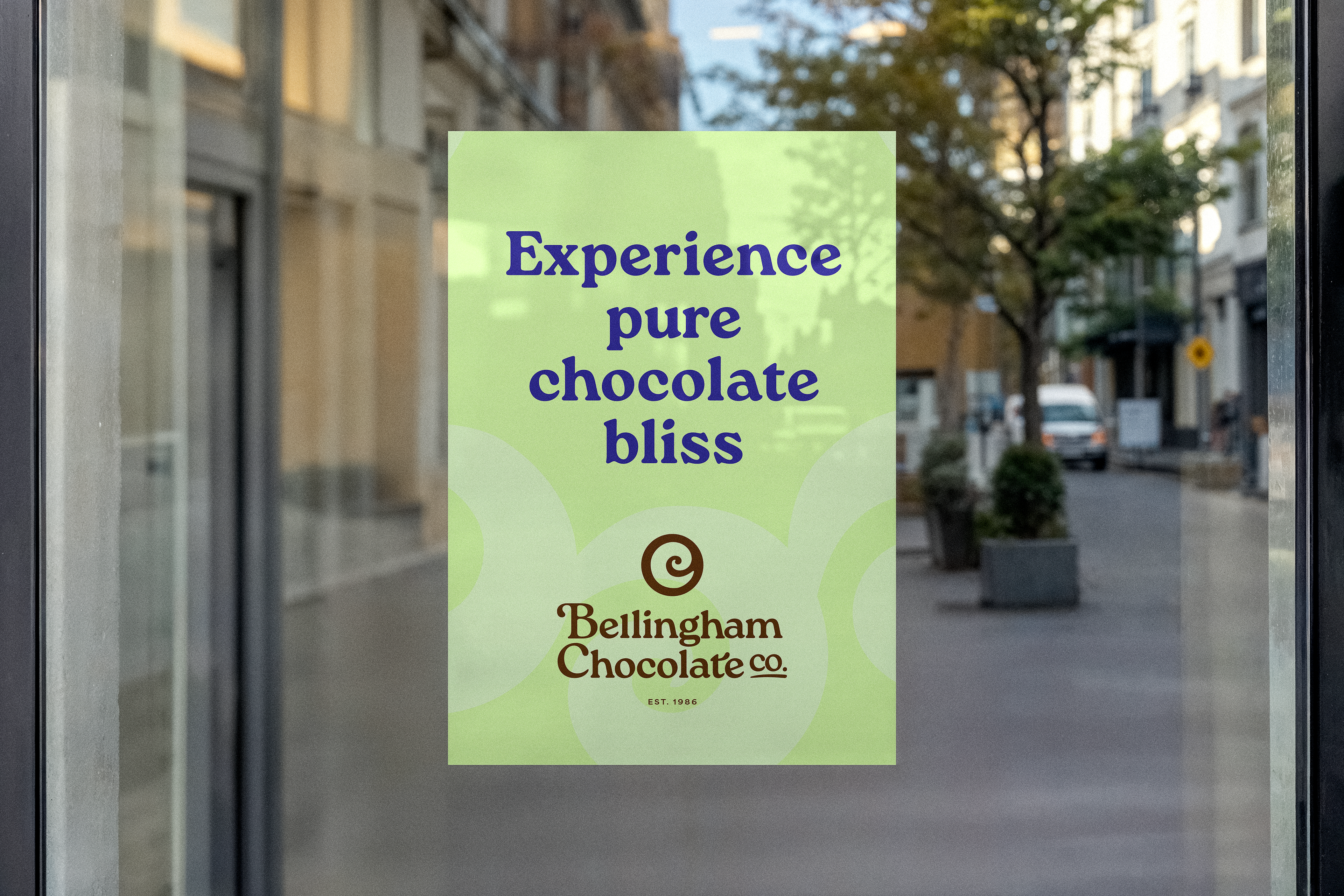
For over 30 years, Bellingham Chocolate Co. has been a Northwest purveyor of artisan chocolate and a cornerstone business offering delicious truffles, handmade gelato, and other delicious confections. Using the highest quality ingredients, they produce exceptional chocolates with the utmost care and attention to detail.
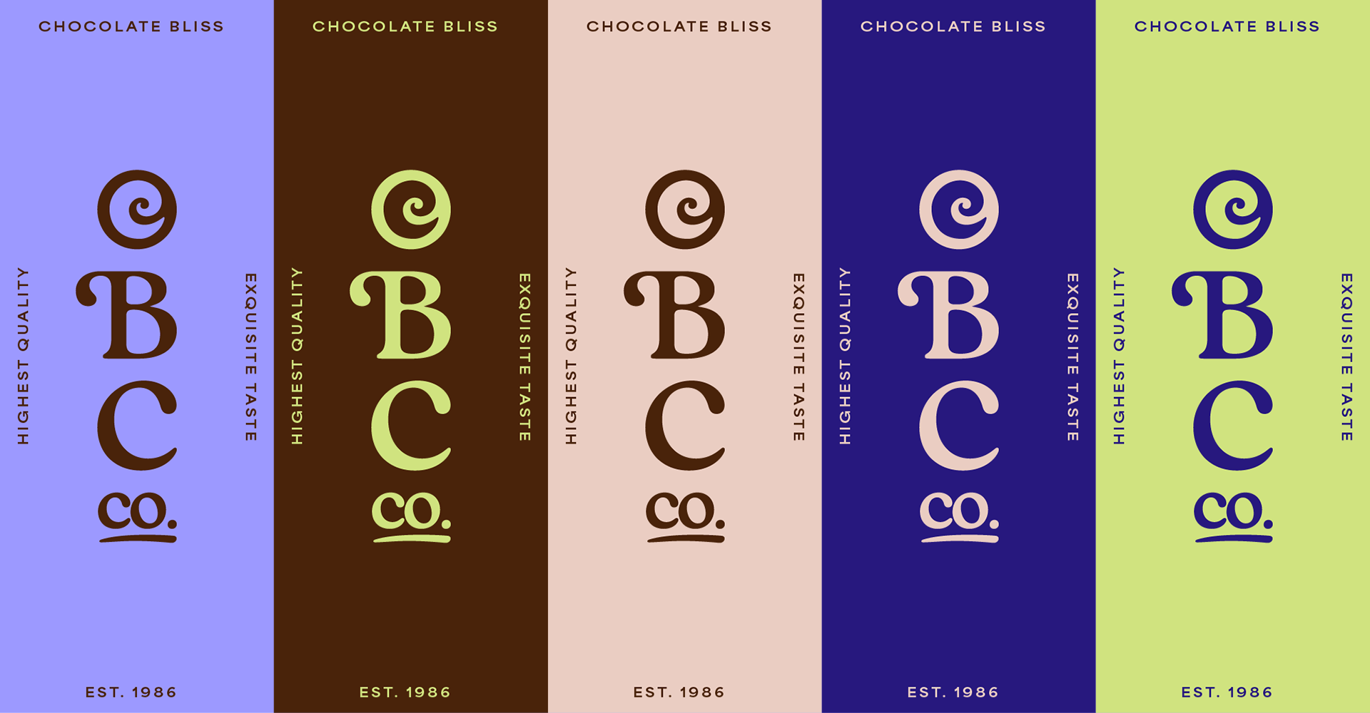
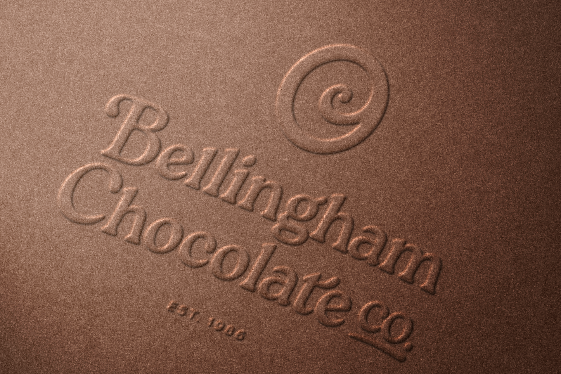
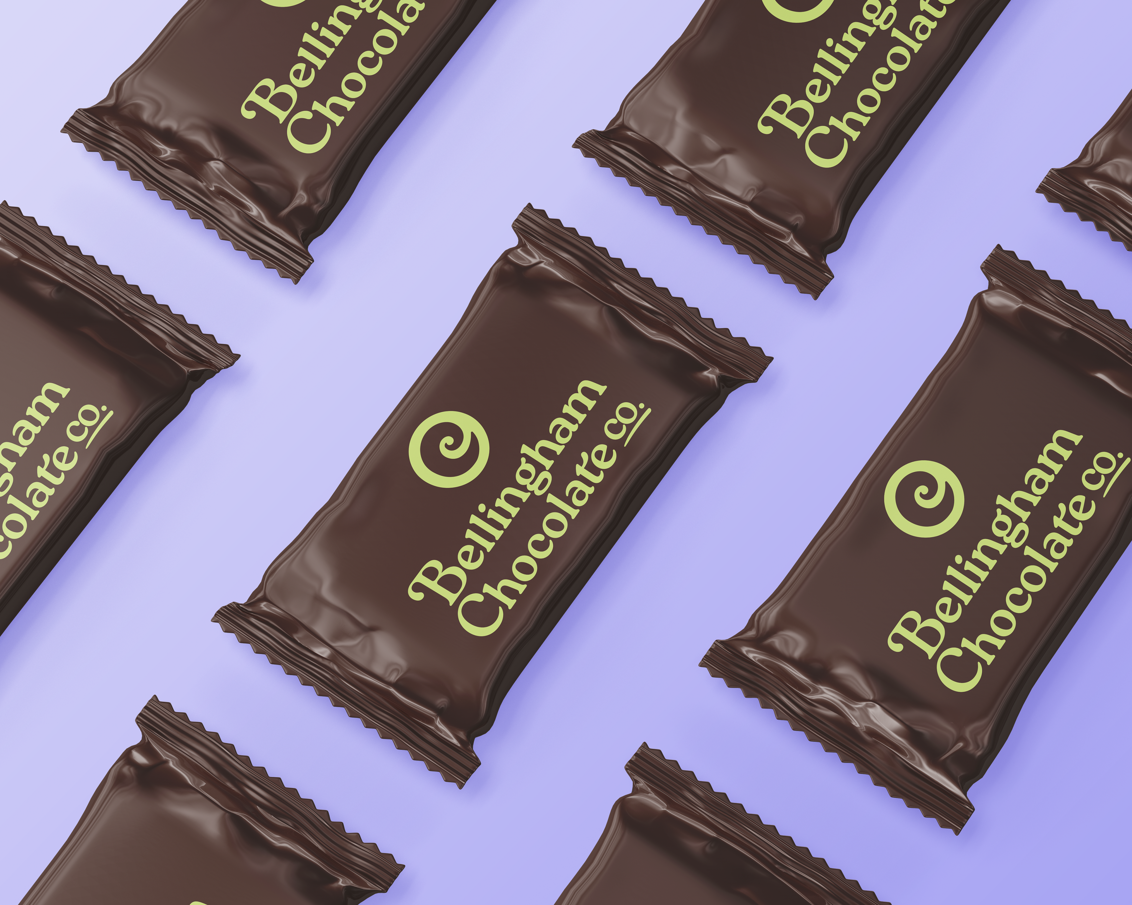
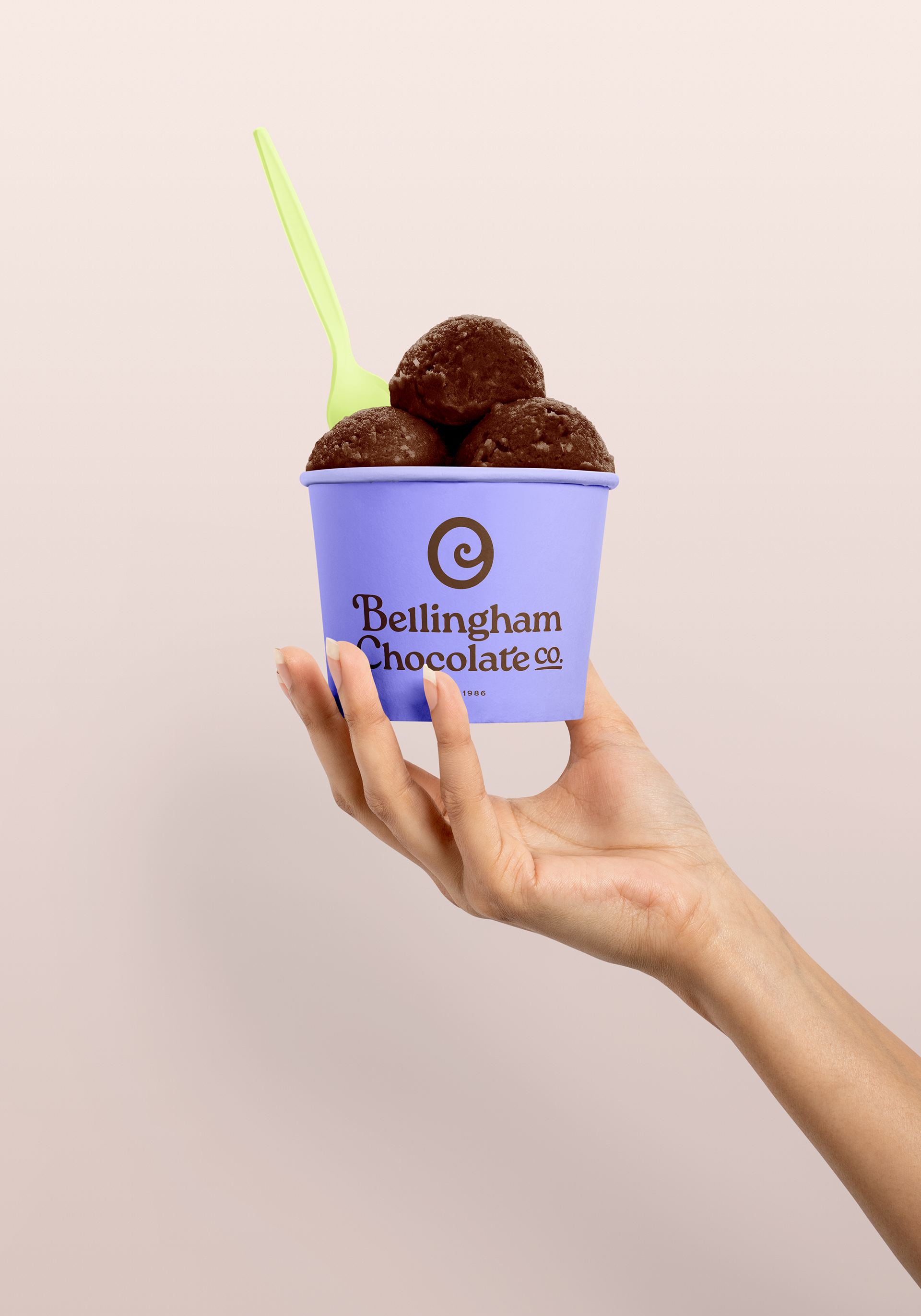
Their original branding used an art deco typeface, dark color palette, and iconography that felt outdated and cluttered. We kept the original swirl concept for the icon but refreshed it to more closely resemble the swirl on top of a chocolate truffle and also mimic the C in Chocolate. We kept the chocolate brown color in the palette and added some fresh, bright colors like lavender and lime green to play off the warm tones and give a more modern feel with bold color combos. Custom patterns and taglines were created for use on social to highlight their incredible brand attributes in a playful and tasteful way. This refreshed approach will help them attract more foot traffic into their retail locations and stand out against their competitors on social.
Their original branding used an art deco typeface, dark color palette, and iconography that felt outdated and cluttered. We kept the original swirl concept for the icon but refreshed it to more closely resemble the swirl on top of a chocolate truffle and also mimic the C in Chocolate. We kept the chocolate brown color in the palette and added some fresh, bright colors like lavender and lime green to play off the warm tones and give a more modern feel with bold color combos. Custom patterns and taglines were created for use on social to highlight their incredible brand attributes in a playful and tasteful way. This refreshed approach will help them attract more foot traffic into their retail locations and stand out against their competitors on social.